Alicante city center

The flat was in it's original form. The same materials and distribution since 1968.
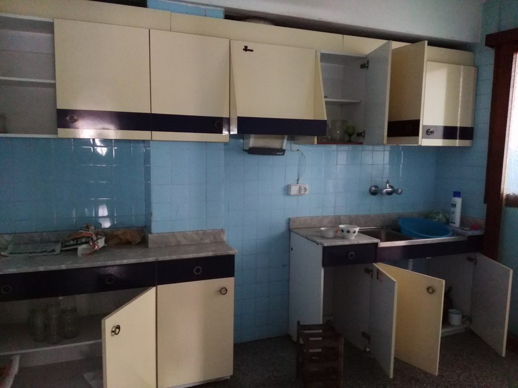
The kitchen was next to an interior courtyard, so lighting was not enough for this use.
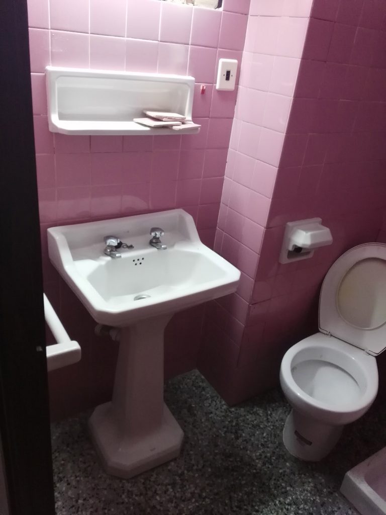
The bathrooms were built with pink tiles. They were dilapidated but those tiles had something special...

The big bathroom...this amazing combination of pink tiles with this floor...the rumour says that if you look this picture for more than 5 seconds, you will loose some diopters.
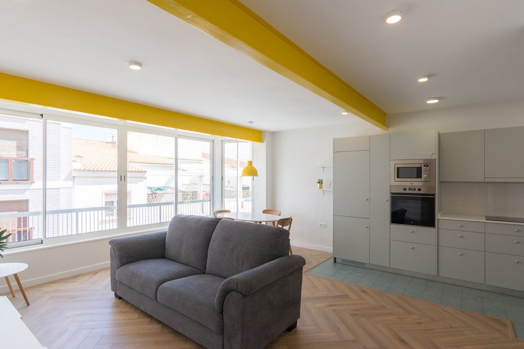
The idea was to merge the original living room and other room in a big space. We also readapted the bathrooms in orther to gain some space and put the kitchen in this bright new area.

Part of the structure is metallic. We clean it up and give it a new mustard importance, creating a new character to the house.
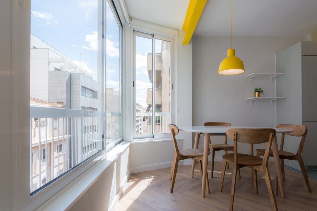
The main facade has a large window that let the natural light go inside during the whole day.
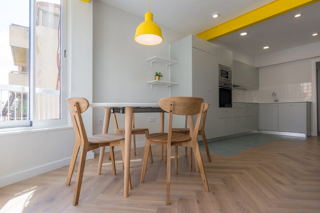
Some details, like lighting (in this case) are in the same yellow than the metallic structure, in order to give an identity to the hole project.
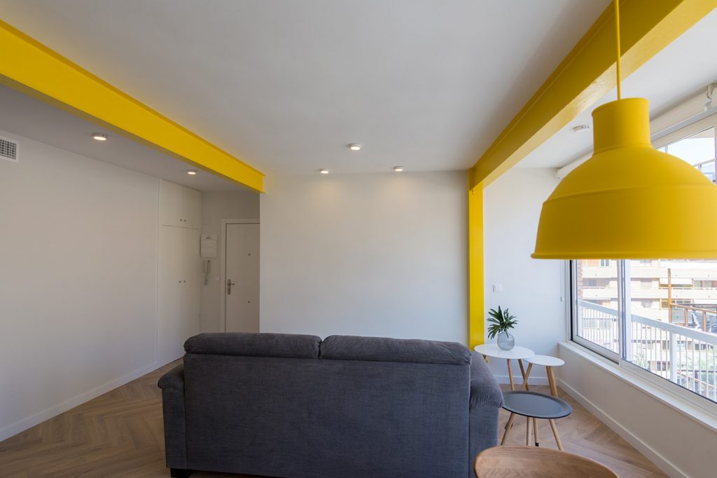
Another view of the living room.
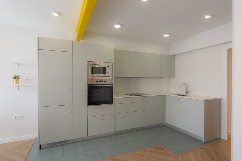
The open kitchen is bigger and lighter than before.
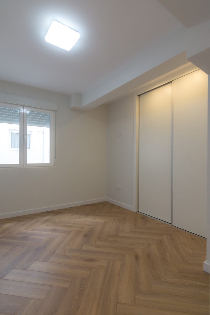
The floor is in a herringbone pattern, giving a confortable and warm texture to the house.

The first bathroom was made with the tiles from the original one. We kept the "sixties essence"and a new relation with the past.
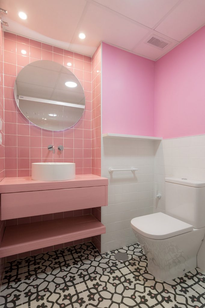
Bathrooms have different kinds of lighting to create changing light effects.
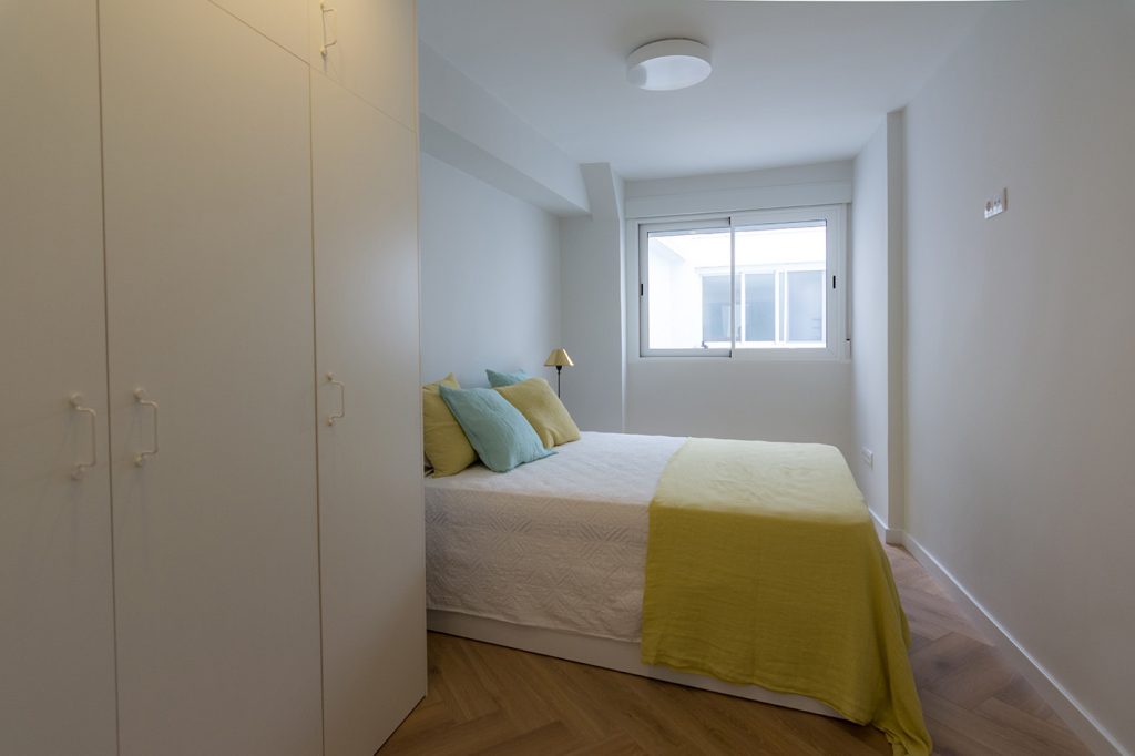
The main bathroom is were the original witchen was. It has a private bathroom.

Another view of the bedroom.
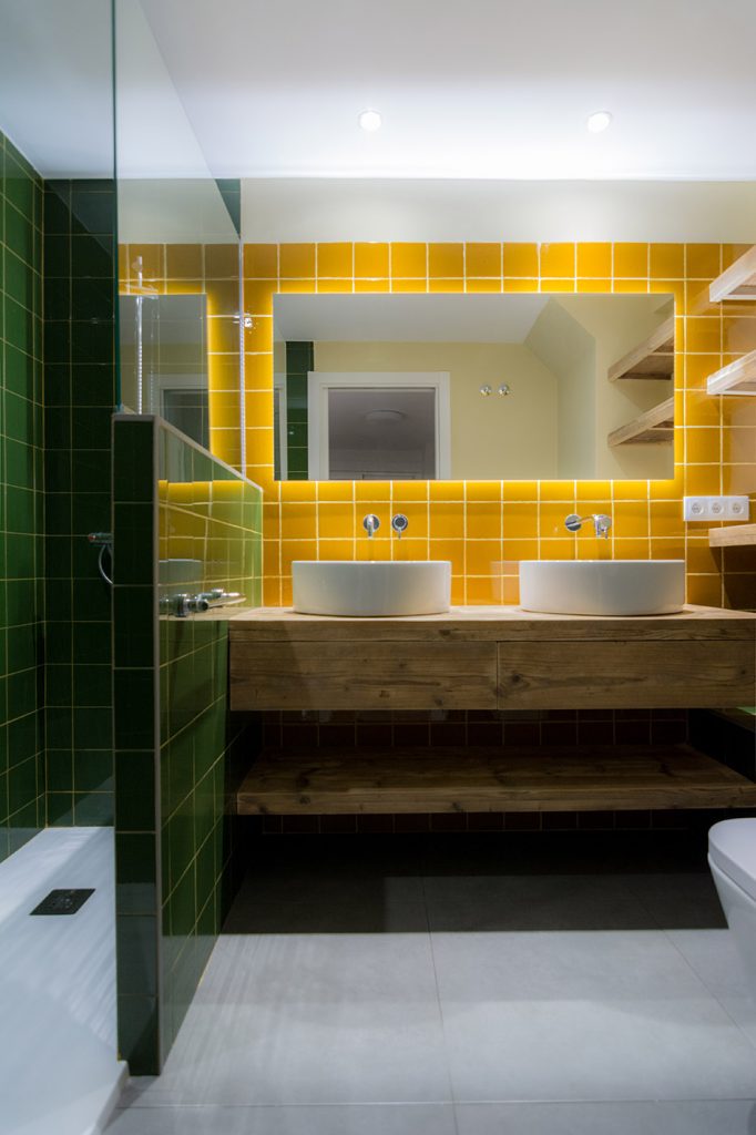
The private bathroom mantains the same tile size composition but with other colors, in a modern expression.
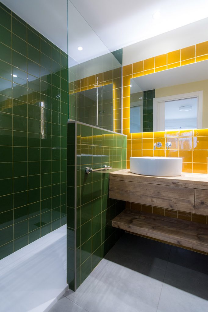
View to the shower.
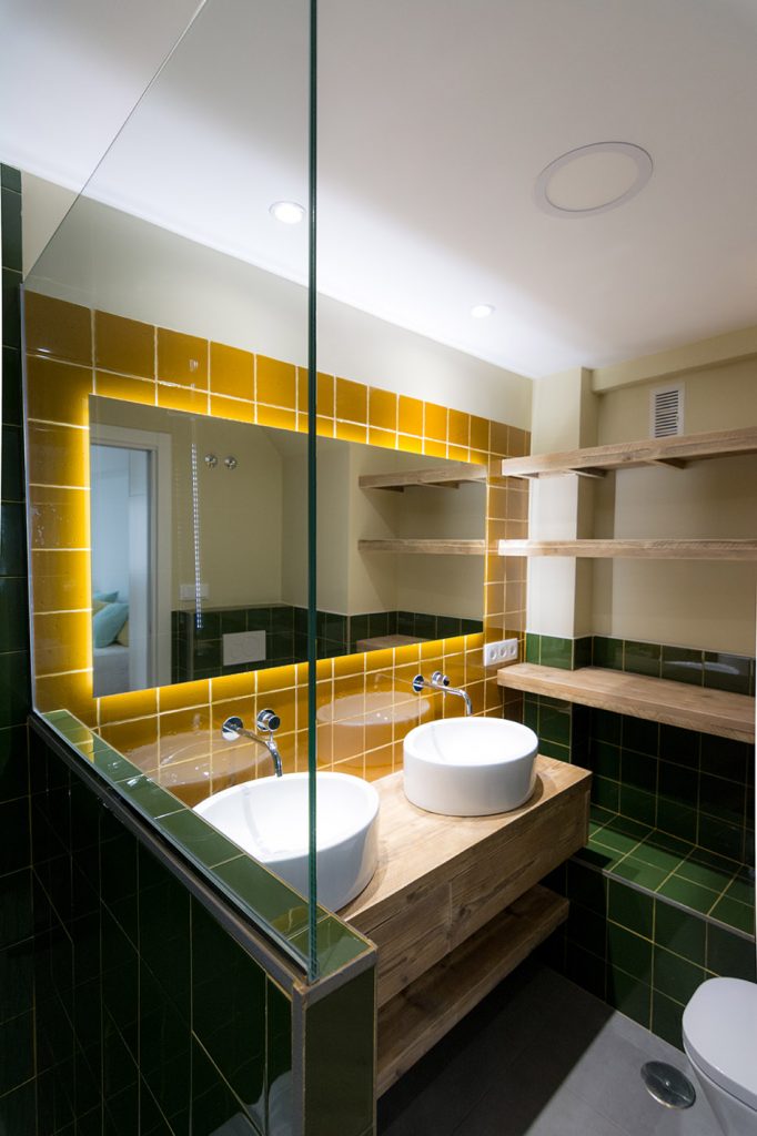
Backlit mirror with a big bathroom furniture with two sinks.
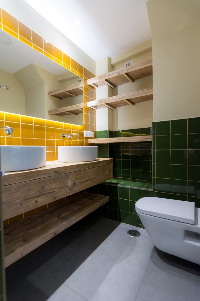
Closer view.